Index
1. What is a Scatter Plot?
2. When to use a Scatter Plot?
3. Step By Step Guidance with DataInsider
1. What is a Scatter Plot?
A Scatter Plot is a diagram describing the correlation between two variables. In a Scatter Plot, dots are used to represent values for two different numeric variables.
The position of each dot on the horizontal and vertical axis indicates values for an individual data point.

Dataset download from Kaggle
2. When to use a Scatter Plot?
A Scatter Plot is recommended when :
Useful when you want to show the direction of the correlation.
Ideal in the case when two variables that depend on each other
More than 10 data points on the horizontal axis
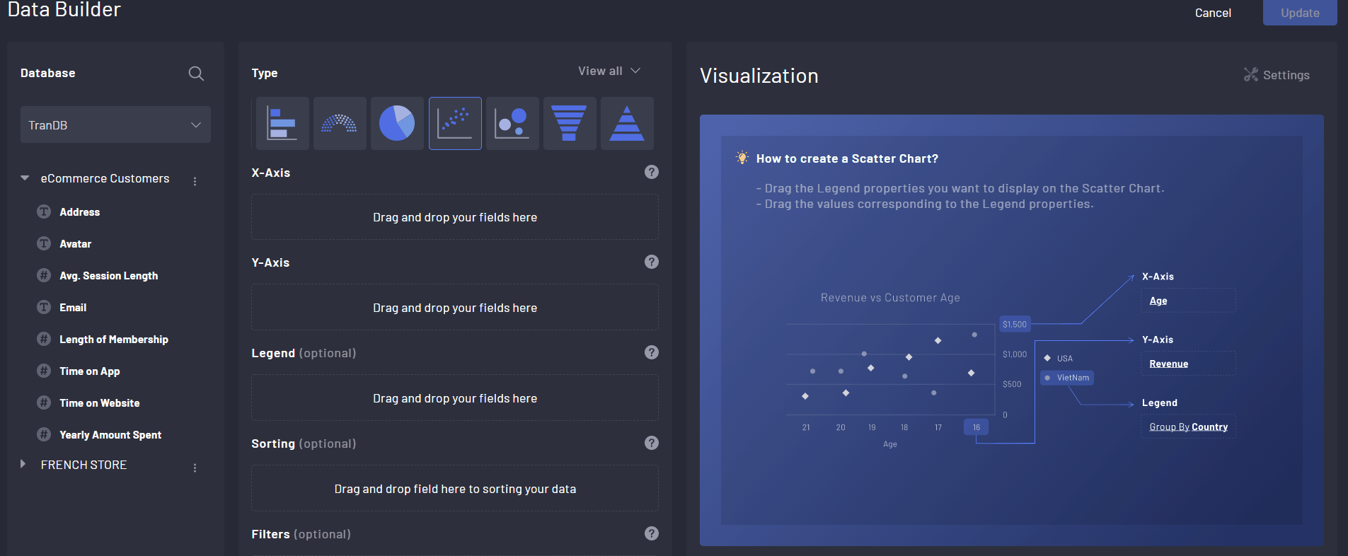
3. Step by step guidance with DataInsider
Desired Chart: A Scatter Plot that displays the relationship between the membership length and yearly spending.
Step 1. Drag Length of Membership to X-Axis
Step 2. Drag Yearly Amount Spend to Y-Axis